Power BI : How to make quick awesome looking dashboard for SCCM
An awesome example of what power bi can do - and its all interactive and dynamic content - which sync's with your sql data in real time. a little bit of sql and little bit of excel does the magic.
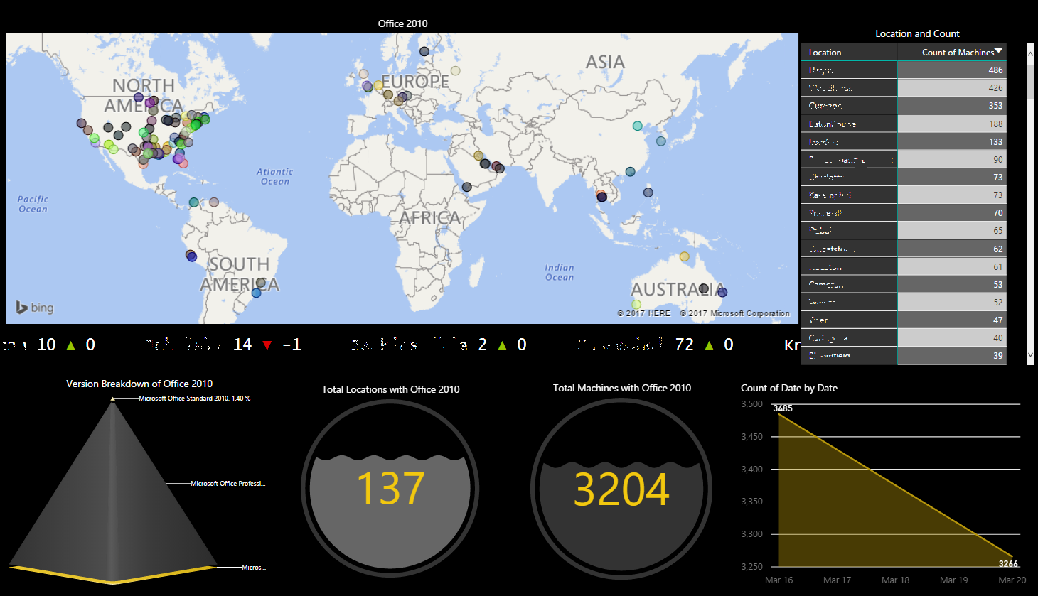
The dashboard above was created to show the remnants of Office 2010 in the environment.
The dashboard above was created to show the remnants of Office 2010 in the environment.
what all do we have in here ?
A dynamically created map based on location pulled from SCCM

a scrolling ticker indicating increase or decrease in count as per trends
count of machines per location

trends indicated by a simple graph

a dynamic water level indicators for data.

a dynamic pyramid based breakup

Query used to pull from SQL >
------------------------------------------------------------------------------------------
SELECT distinct vrs.AD_Site_Name0,
vrs.Distinguished_Name0, vrs.Netbios_Name0, vrs.Resource_Domain_OR_Workgr0,
vrs.User_Name0, sof.ProductName0, sof.ProductVersion0, sof.Publisher0
FROM v_R_System AS vrs LEFT OUTER JOIN
v_GS_INSTALLED_SOFTWARE AS sof ON vrs.ResourceID = sof.ResourceID
WHERE sof.ProductName0 like 'Microsoft Office
Standard 2010' or sof.ProductName0
like 'Microsoft Office Professional
2010' or sof.ProductName0 like 'Microsoft Office Professional Plus 2010'
------------------------------------------------------------------------------------------
want the pbix file ?
share this post on twitter or fb and comment with the link of ur shared post & your email in the comment window below.

looks great...
ReplyDelete